Hiring a Chief Data Officer? Pause. by Michael Thompson

You might waste time, money, and credibility - and still miss the opportunity to truly harness your data. Here’s the real risk: hiring a band-aid role, instead of building a data orchestra.

Below, I briefly explain this in a 3 minute read – and how I might help you get off to a better start.

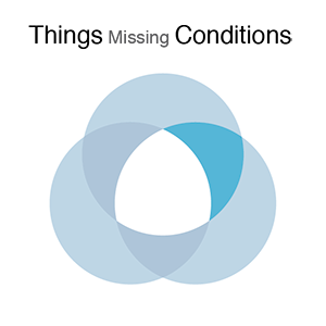
An Officer title implies accountability and responsibility. But that’s a given. What you need is a Chief Data Orchestrator. Why? They have to adeptly conduct and create brilliant performances from four experiences and skills...let’s call them pillars:

  • Analytics, AI, and overall Data Science for revealing and getting ahead of financial, operational, and experiential risk + opportunity. This requires deep technical skills involving statistics, modeling, and understanding of computational boundaries to do it.

  • Data Architecture – your data shouldn’t boss you around. Architecture makes your data accessible, structured, and adaptable for many different contexts.

  • Data Engineering and Technology for putting together the right technology tools, stack, and flow to deliver just enough data, just in time, with as little resource as possible. This requires a considerable amount of coordination with many different parts of your organization…especially overall technology!

    And the fourth - but most importantly:

  • Data Governance and Culture that bridges the distance between the above, and how people use it. It’s not enough to establish rules and procedures for data protection, data use, and data monetization. This is probably the most overlooked role of all – and is the one that the Chief Data Orchestrator must use for the other three pillars of success to work together and thrive.

    Hiring a conductor matters as much as hiring virtuosos. Without orchestration, even brilliant individuals create just noise.

    Before hiring a CDO, ask yourself:

  • What do we already have across these 4 pillars?

  • How mature, aligned, and connected are they?

  • What’s missing?

    A readiness assessment – one that looks at those three questions - only takes a few weeks to get insights together. And that will prove to be timesaving and valuable. When you know how good your existing platform and talent is for your CDO’s success – your new Chief Data Orchestrator will be successful and grateful for the homework you’ve done.

Are You About to Bump into a Data Iceberg? by Michael Thompson

A lot of unmeasured experience may be hiding from view.

Data Iceberg-01.png

We all, at one point or another, have known that sinking feeling of having missed the bigger picture. The worst times are when we’ve put a lot of effort, time, and analyst hours into a business decision that turned out to be missing a lot of important information.

Sometimes it can be revealed to us either by our manager, or a colleague, who will say out loud in the middle of a meeting:

“I don’t recognize these numbers you’ve got here.”

The bigger the data set, the more effort involved, these all add up to a bigger cost of hitting the skids. We all know the importance of what we tend to call sanity checks. But, how do you create a discipline for:

  • Catching missing data at the data measurement and gathering stages, versus the analysis stage?

  • Helping you think about what could be missing?

Three Easily Remembered Questions

Having a complete set of data doesn’t mean just the entire file. It really means the entire measurable experience that matters. To illustrate that, our measurable experience can be simplified down to three basic questions: what are the things, times, and conditions?

Venn Titles-01.png
  • Things. These are the subjects of our data story; the who, the what.

  • Time. Time is needed to measure change. We want to know about a whoor a what at two different points in time, so that we can make comparisons.

  • Condition. Condition is what we are comparing between two different points in time. For example, amounts, or locations.

An Example: A Troubled School Principal

Let’s put this into a real-world example. Imagine you are working for a school principal. She is concerned about student attendance, and wants the latest data to support a new attendance policy. You might go to the main office and ask for a report on absences. Later that day, you get back the following absence report:

A list of 100 students, showing that five were absent for more than two days between May 1 and May 31st.

Breaking this down:

  • Thing: Students

  • Time: Month of May

  • Condition: Absence of more than two days

Doesn’t sound too bad…and you might conclude that attendance might not be as bad as you think.

Until you showed it to the principal…

The principal looked at this report and said the problem is far worse. Why? As you listen to her response, we realize we might have caught these problems by asking the right questions up front.

What Did We Miss?

We missed out on a lot of experience that wasn’t measured. We are only seeing the above-water part of the iceberg.

Framework-01.png

We could have started by taking the report and asking some things-times-conditions questions (technically, we might refer to these as first order questions):


Missing Things-01.png

Students: Does the school in fact have 100 students?

Hang on, we have 110 students. 10 of them are from the district we annexed in January. That district uses 5-digit IDs, and we never reassigned them 6-digit IDs. So, the report missed them.

Missing Times-01.png

Days: May has 31 days. Why does the file only have 18 days?

Well, weekends aren’t included. Memorial Day wasn’t counted. But also, for 2 days, the attendance system was down.

Missing Conditions-01.png

Absences: Wait a minute. What do we mean by attendance?

Oops. The principal considers attendance to be either more than 2 days’ absences..or 1 tardiness mark. We are missing tardiness marks.


So far, we should have had:

  • 110 students X 20 days X 2 conditions (absent, tardy)= 4,400 measurements.

But, as a result of what was missing, we only ended up with:

  • 100 students X 18 days X 1 condition = 1,800 measurements

That’s only about 40% of the measurements we want. It turns out these small differences added up to a big difference in the amount of information we actually have.

Going Further

But, as it turns out, you don’t even have 1,800 measurements. When you look at the report more closely, and do some quick calculations, it turns out you only have 1,272 — only 29% of what you want. Why? We didn’t see even more measurable experience, stemming from the combination of second-order questions:


Things Missing Times-01-01-01.png

10 students are missing two days of time sheets.

It turned out their regular homeroom teacher was out sick, and the substitute forgot to turn in the timesheets.

Things Missing Conditions-01.png

8 students’ timesheets are missing tardiness marks.

They were on a work-study month-long assignment; their work sponsor only marked down absences. The students’ persistent tardiness came out in the negative written reviews.

Times Missing Conditions-01.png

There are 2 days in the report when we have null values for absences.

The system also had a two-day glitch, and didn’t record absences. The system only recorded tardy marks for those glitch days.


Between our first and second order information gaps, over two-thirds of our measurable experience is underwater. Why? Merely some ordinary glitches and poor definition of what we needed in the first place.

Seeing the Whole Picture, and the Problem

We’re using an iceberg analogy — and showing it using a Venn diagram. A Venn diagram like this can’t be perfectly calibrated to the proportion of information that is missing. However, it organizes how we think about the problem, and helps us visualize what’s there, and what’s missing.

Below is another example, in a slightly more interactive format. The topic: COVID-19 data. Many people at this very moment are scrambling to make sense of incidence data. Like many data projects, these support important decisions that can have real impact — and risk. You can see an example of how the data, when framed as things (counties), time (days), and conditions (cases, deaths), may have some missing experience. As a data scientist, or as a data visualization professional, you’ll need to identify these kinds of problems, communicate them to your audience, and decide how to manage them.

When you start your data project, you now have a way, at the beginning (!) rather than at the end, to:

  • Think about what you need

  • Ask questions about what might be missing

  • Visualize what you have, and what’s missing

Using COVID-19 Data by Michael Thompson

The purpose of my post here is to share some features and trends, as well as problems that I’ve seen with public COVID-19. It’s not meant as an overall tutorial for anyone wishing to begin using public COVID-19 data. There’s plenty of good suggestions in many of the public health policy and data visualization forums. Go there for those.   

And hey - let’s work together. After you check this out, please comment, correct me, or tell me something different or new.

PUBLIC SOURCES OF DATA

Every day more and more are available. There’s been a few helpful aggregations of WHO, JHU, and Country, State, and Region that I’ve used, including: 

Starschema’s aggregation, here: https://github.com/starschema/COVID-19-data

The New York Times also is a good aggregation, here: https://github.com/nytimes/covid-19-data

UsaFacts runs a comprehensive site at https://usafacts.org/visualizations/coronavirus-covid-19-spread-map/

FEATURES AND TRENDS

Here’s a couple of either good (or bad) data features and trends that I’ve seen so far.

Relationship between metric and extent or severity of outbreaks

Early on, I saw lots of references to the number of reported COVID-19 cases as a measure of the extent of the outbreak. We now know that reported cases are only a factor of the number of people who have been tested, rather than the true extent of the outbreak. Here in the United States well, name your reason, but we’ve unable to quickly deploy reliable and comprehensive testing. And, the results that come back are statistically limited in terms of health, economical, and sociological representative value. 

Unfortunately, deaths tell a better story. For most developed countries, when someone dies, the death and cause of death is recorded by an authority, who then regularly tabulates this statistic. Everyone pivoted quickly to this - for example, John Burn-Murdoch along with the data viz team at the Financial Times recognized this and added deaths as a measure.

Screen Shot 2020-04-15 at 10.05.04 AM.png

However, as we go on, it’s even hard to agree on how many have died from COVID-19, for reasons I’ve mentioned below in the Technical Challenges section.   

The ‘how much and where’ versus the ‘how bad and when’

Outbreak maps, showing where COVID-19 is happening are news and social media’s most popular and readable visualizations of the outbreak. These maps, featuring either color-coding or bubble marks, show the relative size of cases or deaths. You can easily see where there is the greatest incidence of outbreaks.  

Screen Shot 2020-04-15 at 10.54.18 AM.png


Maps have a harder time communicating how things are going, and in particular, trending. Colors and arrows can show trending; some of the more sophisticated examples include this trending representation from Mathieu Rajerison, here: 

Screen Shot 2020-04-15 at 10.13.11 AM.png

We can show growth rate trending of either cases or deaths. Early on, and again, the Financial Time’s chart is an excellent example of this – I and others made the knee-jerk mistake of dismissing a scale showing the number of cases that looked thoughtlessly distorted by an arbitrary scale. Smarter people quickly jumped in to explain that the scale was logarithmic, and totally appropriate. Epidemics, by nature, tend to grow at an exponential rate, rather than a linear rate. 

Screen Shot 2020-04-15 at 10.18.23 AM.png

The idea behind the chart (example above provided by Chris Canipe at Reuters then is to show how an individual cohort’s (whether it’s a country, or a segment of a population) experience is improving or worsening (as seen by the trajectory and inflection of the curve) but also the rate of the exponential growth, as shown by the angle of the curve. Most of these charts have plotted a perfect exponential growth rate as a benchmark against which each population can be measured. These charts are super valuable for showing the severity of the outbreak, and also extrapolating over time the extent of total deaths or cases that we can expect in the next few weeks.    

Decontextualizing and dehumanizing COVID-19 causalities through relativity and probabilities 

I often see COVID-19 cases and deaths presented in ways that dehumanize and decontextualize the human condition of falling ill, being hospitalized, or dying. They include: 

  • Incidence relative to the entire population or a cohort / segment of the population. This is typically presented as a way of showing a probability or statistical magnitude. If only 1 out of 20 people (ie a 5% average) have an incidence, then we feel more comforted than a higher probability, for example, 1 out of 2 people having an incidence. However, at scale, this completely ignores the human costs. In a city of 8 million people, even 1 out of 100 people represents 80,000 people whose lives are disrupted, permanently changed, or ended. The social, psychological and economic costs of that are devastating, especially when society already operates with a thin safety net under the presumption that people are always going to be fine. 

  • Incidence relative to other typical cases of illness or mortality. For example, COVID-19 cases compared to heart disease, cancer, diabetes, or vehicular accidents.

Screenshot 2020-04-15 at 10.31.04 AM.png

To anyone who might want to take this fight up: please stop. This second example is particularly dismissive.

  1. The timing of the incidence is much more concentrated than the distribution of other types of illness and mortality, thereby overloading the hospital and health care systems.

  2. The application of care to a cancer patient or an accident victim requires different resources and protocols for a COVID-19 patient, which are furthermore novel and changing, worsening the system overload.

TECHNICAL CHALLENGES

Aside from how the information is applied, there’s also challenges I’ve seen and had with the data that have to do with how it is collected, gathered, and reported. These have been getting in the way of credibility and reliability. I’ve put a few down here that I think are causing the most problems - watch out for them:

Common discrepancies and differences

Here in New York City, we’ve had bad news, all day, all the time. When I go through twitter and news media I’ll probably see three or four versions of yesterday’s cases and deaths. They are probably from:

  • Timing differences: some publishing sources may publish several times throughout the day; a version you see may be the 5PM posting versus the midday posting that was used somewhere else.

  • Version differences: sources often revise their data due to errors, recounts, or after revising methods.

  • Aggregate totals different from individual totals: for example, a country summary may have a different number due to the aggregate of timing and version differences that I talked about earlier.

Data format and combination/join failures

A lot of the data collection is done by hand, by professional but super-stressed people filling out semi-arbitrary forms. Because many of the processes used to collect, aggregate, and publish the data are manual, and the point-of-capture itself is almost always manual, we’ll see classifications that may result in join failures or misclassifications. Some examples I’ve seen include: 

  • Location name confusion: Good example is New York – does it refer to the city, the county, the state, the MSA;

  • Filename confusion: Link or file name contains date, and date hasn’t been updated: this one is self-explanatory; it’s easy to miss since it’s often the last step of an automated process that requires a person to publish it. Often the ‘version’ field of a file hasn’t been updated, which will corrupt version-based joins. 

Vague titles and naming for metrics

It’s difficult to tell whether what we are looking at is new or total, and over what time frame. Often, the documentation is not footnoted or annotated, and the reference material is in a different location than the published data. The following metrics have been used as a measure of the extent and severity of the outbreak (I mentioned cases and tests already): 

  • Cases

  • Tests

  • Deaths

  • Hospitalizations

 Deaths: Medical and examiner settings have been totally overwhelmed in the last two months. It’s certainly been challenging for even for these officials with the most resources to evaluate, record, and send information under their normal processes and protocols. As a result, numbers will update.  

Hospitalizations: It can be difficult to confirm whether the hospitalization metric is:

  • A total number, representing the net total of admitted patients minus discharges;

  • Consistently a COVID-19 diagnosis, as the admission diagnosis may be same as the interim or discharge diagnosis 

 Pace, Urgency, and Political Factors

Governments, journalists, NGOs, and other professional bodies have been feverishly trying to make sense of the situation. The information coming out is going to feature less validation, peer review, and editorial oversight than normal. There’s also been raw political currency or social control concerns that factors into what gets released, or doesn’t.  

Just to conclude on this note, and to ask others that might want to participate here to do the same: I’d like to focus, as a professional, on the ways we can evolve our trends and methods, and overcome our technical challenges.  Most people are working hard as hell to bring us the truth, and often risking their health - and life - along the way. We owe them a huge amount of gratitude.

NYC's Inequalities of Hospital Intensive Care Capacity by Michael Thompson

Screen Shot 2020-04-05 at 11.50.57 AM.png

Regardless of whether it has been a failure of hospital corporation governance vs. profits, legislature, city administrators, zoning, or foresight, the comparison is painful. Based on NY DOH’s certification of hospital ICUs, by borough, prior to the COVID-19 crisis, there’s tremendous inequality by borough to handle a surge of patients needing intensive care. Manhattan has about 1 ICU per 2,500 people; Queens has 1 for about every 11,900 people. Unfortunately, this is playing out now as Elmhurst hospital in particular has been completely overwhelmed given its centrality to Queens, and its limited number of beds.

Screen Shot 2020-04-05 at 11.44.32 AM.png

Now is not the time for blame, finger pointing, or distraction. But once we are able to find a way through this, and make sense of the situation, there is clearly a need to address real structural problems in New York City’s pandemic and health crisis capacity planning.