Dear 12-Month Calendar: It’s Not You, It’s Me. by Michael Thompson

Our calendar was invented for astronomy and agriculture, not for the 21st century knowledge worker in the midst of COVID-19.

trashcan-01.png

As we adopt to the weird new COVID-19 reality of working at home, and days blend into weeks and months, we might stop for a moment and look how far our reality in the working world has drifted from what the calendar was originally meant to do.

When COVID-19 Came to Town

Pre-pandemic, the modern office worker’s working week was spent putting in 8 hours at work, with time spent going back and forth to work. There was in-between time, and of course sleep.

But with COVID-19, many of us are working from home. For some of us, this isn’t a new experience. We have already been blurring the line between office hours and working hours with mobile devices and WFM solutions. But now, we’re asking: how many of us should work remotely? And how should we do it?

You and your manager and may have different views on this answer.

  • You: The boundary between work and home was getting blurry already. Now it’s even more blurred. I feel like I’m never quite “off” work.

  • Your Manager: How much work is so-and-so really doing at home? And what about all of that time they don’t spend commuting anymore?

We all want to know that we are doing a good job. But you know the old saying: you can’t manage what you can’t measure. Measuring productivity is about how much you are producing during a set time. Here’s the issue:

If we continue to define productivity as time spent in an eight-hour day, following a 12-month, Monday-Friday calendar, we are going to be doing it wrong.

Our Relationship Has Always Been Messy

That four-quarter, twelve-month, seven-day calendar is the product of a lot of ancient things trying to get along with each other. A long time ago, sectioning out the year mattered when you were thinking about seasons: planting, growing, harvesting, and hunkering down for winter. We used to keep track of our progress through the seasons by counting out the number of times the moon went through its phases. That in itself is a little wonky, because we see the moon go through a complete phase (from our sidereal perspective) every 27 days, 7 hours, and 43 minutes. What makes this messier is that different civilizations liked to break down the 24-hour days during a lunar phase into segments, and through our history we’ve settled on a four-segment cycle of seven days. Throughout Babylonian, Egyptian, Roman, and modern times we’ve done all of this tinkering to reconcile the schedule of the moon with the orbit of the sun. As a result, we have an inconsistent set of days per month.

Most western civilization, before the 20th century, defined six of the weekdays as work, and one for the sabbath. For reasons largely attributed to Henry Ford’s assembly line and the evolution worker representation and bargaining power, we conceded another day in the 20th century, resulting in the 5-day work week. But that created even more calendar inconsistency. Not only are some months shorter than others, but some also have fewer working days than others. And finally, whether in the United States or elsewhere, we have a growing number of official holidays that grant us time off for additional worship or remembrance.

For example, here’s the differences in 2020’s working days by month and by quarter in the United States, accounting for government holidays:

Screen Shot 2020-06-23 at 3.48.09 PM.png

On the surface of it, a six day difference between 3Q and 4Q may not seem like much, but it amounts to real differences in financial and productivity results when considering fixed costs.

Should We Take Some Time Off?

Along with the forty-hour work week, the 20th century also brought a progressive definition of the ideal amount of time off for workers. As the 20th century came to a close, and the 21st century began, we have evolved into a flexible system of Paid Time Off (PTO) that includes vacation, sick time, and floating holidays, recognizing the diversity of our workforce.

Then, there’s that tricky subject of Fridays, and with it, mobile technology for remote working. Who hasn’t felt a sense of relief on Friday as the weekend approaches. And as mobile technology has improved our ability to work remotely, who hasn’t taken off early on one of these Fridays? If you’ve been an office worker, commuting to and from work, you’ve wanted to avoid the commuter snarl. Especially a Friday before a holiday weekend. Or even…most Fridays?

Backlash and Breakup

A few years back, I worked for a bank where this growing trend of flexible PTO and mobile computing came to a head. Our COO decided to walk the office on a Friday afternoon and saw…empty seats. Lots of them. A nice way of describing his reaction was that he felt his bank and his shareholders were being cheated out of labor hours and the real estate expense that came with it. Those labor hours, and that office space expense, was big, and real, and clearly not being put to work during traditional office hours.

I ended up with a project that attempted to make some sense of all of this, and ideally, help encourage a better situation. But the project quickly ran into problems, because we were being asked to use the 12-month, 5-day, 8-hour way of thinking to judge the performance of our workers. It was based on when office space was being used, rather than what was actually being done by the employees. What you see below definitely wasn’t the view that we showed the COO, but surely in his mind the story ended up looking like this:

Download Image-2.png

Looks like a broken mirror? Well, it was. We were only using office attendance as a measure of productivity. And when we tried to compare productivity month-over-month, quarter over quarter, we ran into all of the caveats in the data. Structural differences between calendar months. Holidays. Vacation seasons. And yes, Fridays. Adding it all up, it didn’t look too impressive. And because of all the variability that came from structural differences and how employees used PTO, it was hard to tell how we were doing, month over month, quarter over quarter.

Where Do We Go From Here?

As we redefine worker productivity measures, we have an opportunity to get it right, but it’s going to require time, patience, and investment. We’ve put a tremendous amount of tradition, infrastructure, and general orientation toward the 5-day, 8-hour workweek. This is not a call to work longer hours. Rather, it’s meant to ask us to look at the same thing, differently:

  • Rather than measuring only the where and the when of doing something, can we measure more of the what and how?

  • What did we get done, together, and how well did we do it?

Some industries have already moved beyond a four-quarter financial performance year that begins in January and ends in December. Retail firms have seasonality; accounting firms in the United States often center around a busy season for tax preparation, with a fiscal year ending in June, not December.

To be clear, we are a long way from abandoning quarterly reporting. But we need to find a new convention for considering the performance of firms, especially those involved in pharmaceuticals or technology whose product development, releases, and performances aren’t intrinsically tied to a calendar.

That’s at the company level. At the employee level, the same. As of 2016, Harvard Business Review estimated that nearly 1/3 of companies had already abandoned annual reviews, with famous companies like Adobe, Deloitte, and Accenture leading the way.

One thing is very clear: under COVID-19, office attendance as a productivity measure is out the window. And, with so much uncertainty with what will happen this quarter and the next, it’s time to put much more emphasis on what you get done, when it’s due, rather than arbitrary calendar comparisons. Should we abandon the annual review? How about a project-by-project, or even Kaizen approach, evaluating for small, incremental, continuous improvements?

What ideas are you seeing that can help us move to a better way of measuring productivity and performance over time?

Are You About to Bump into a Data Iceberg? by Michael Thompson

A lot of unmeasured experience may be hiding from view.

Data Iceberg-01.png

We all, at one point or another, have known that sinking feeling of having missed the bigger picture. The worst times are when we’ve put a lot of effort, time, and analyst hours into a business decision that turned out to be missing a lot of important information.

Sometimes it can be revealed to us either by our manager, or a colleague, who will say out loud in the middle of a meeting:

“I don’t recognize these numbers you’ve got here.”

The bigger the data set, the more effort involved, these all add up to a bigger cost of hitting the skids. We all know the importance of what we tend to call sanity checks. But, how do you create a discipline for:

  • Catching missing data at the data measurement and gathering stages, versus the analysis stage?

  • Helping you think about what could be missing?

Three Easily Remembered Questions

Having a complete set of data doesn’t mean just the entire file. It really means the entire measurable experience that matters. To illustrate that, our measurable experience can be simplified down to three basic questions: what are the things, times, and conditions?

Venn Titles-01.png
  • Things. These are the subjects of our data story; the who, the what.

  • Time. Time is needed to measure change. We want to know about a whoor a what at two different points in time, so that we can make comparisons.

  • Condition. Condition is what we are comparing between two different points in time. For example, amounts, or locations.

An Example: A Troubled School Principal

Let’s put this into a real-world example. Imagine you are working for a school principal. She is concerned about student attendance, and wants the latest data to support a new attendance policy. You might go to the main office and ask for a report on absences. Later that day, you get back the following absence report:

A list of 100 students, showing that five were absent for more than two days between May 1 and May 31st.

Breaking this down:

  • Thing: Students

  • Time: Month of May

  • Condition: Absence of more than two days

Doesn’t sound too bad…and you might conclude that attendance might not be as bad as you think.

Until you showed it to the principal…

The principal looked at this report and said the problem is far worse. Why? As you listen to her response, we realize we might have caught these problems by asking the right questions up front.

What Did We Miss?

We missed out on a lot of experience that wasn’t measured. We are only seeing the above-water part of the iceberg.

Framework-01.png

We could have started by taking the report and asking some things-times-conditions questions (technically, we might refer to these as first order questions):


Missing Things-01.png

Students: Does the school in fact have 100 students?

Hang on, we have 110 students. 10 of them are from the district we annexed in January. That district uses 5-digit IDs, and we never reassigned them 6-digit IDs. So, the report missed them.

Missing Times-01.png

Days: May has 31 days. Why does the file only have 18 days?

Well, weekends aren’t included. Memorial Day wasn’t counted. But also, for 2 days, the attendance system was down.

Missing Conditions-01.png

Absences: Wait a minute. What do we mean by attendance?

Oops. The principal considers attendance to be either more than 2 days’ absences..or 1 tardiness mark. We are missing tardiness marks.


So far, we should have had:

  • 110 students X 20 days X 2 conditions (absent, tardy)= 4,400 measurements.

But, as a result of what was missing, we only ended up with:

  • 100 students X 18 days X 1 condition = 1,800 measurements

That’s only about 40% of the measurements we want. It turns out these small differences added up to a big difference in the amount of information we actually have.

Going Further

But, as it turns out, you don’t even have 1,800 measurements. When you look at the report more closely, and do some quick calculations, it turns out you only have 1,272 — only 29% of what you want. Why? We didn’t see even more measurable experience, stemming from the combination of second-order questions:


Things Missing Times-01-01-01.png

10 students are missing two days of time sheets.

It turned out their regular homeroom teacher was out sick, and the substitute forgot to turn in the timesheets.

Things Missing Conditions-01.png

8 students’ timesheets are missing tardiness marks.

They were on a work-study month-long assignment; their work sponsor only marked down absences. The students’ persistent tardiness came out in the negative written reviews.

Times Missing Conditions-01.png

There are 2 days in the report when we have null values for absences.

The system also had a two-day glitch, and didn’t record absences. The system only recorded tardy marks for those glitch days.


Between our first and second order information gaps, over two-thirds of our measurable experience is underwater. Why? Merely some ordinary glitches and poor definition of what we needed in the first place.

Seeing the Whole Picture, and the Problem

We’re using an iceberg analogy — and showing it using a Venn diagram. A Venn diagram like this can’t be perfectly calibrated to the proportion of information that is missing. However, it organizes how we think about the problem, and helps us visualize what’s there, and what’s missing.

Below is another example, in a slightly more interactive format. The topic: COVID-19 data. Many people at this very moment are scrambling to make sense of incidence data. Like many data projects, these support important decisions that can have real impact — and risk. You can see an example of how the data, when framed as things (counties), time (days), and conditions (cases, deaths), may have some missing experience. As a data scientist, or as a data visualization professional, you’ll need to identify these kinds of problems, communicate them to your audience, and decide how to manage them.

When you start your data project, you now have a way, at the beginning (!) rather than at the end, to:

  • Think about what you need

  • Ask questions about what might be missing

  • Visualize what you have, and what’s missing

Using COVID-19 Data by Michael Thompson

The purpose of my post here is to share some features and trends, as well as problems that I’ve seen with public COVID-19. It’s not meant as an overall tutorial for anyone wishing to begin using public COVID-19 data. There’s plenty of good suggestions in many of the public health policy and data visualization forums. Go there for those.   

And hey - let’s work together. After you check this out, please comment, correct me, or tell me something different or new.

PUBLIC SOURCES OF DATA

Every day more and more are available. There’s been a few helpful aggregations of WHO, JHU, and Country, State, and Region that I’ve used, including: 

Starschema’s aggregation, here: https://github.com/starschema/COVID-19-data

The New York Times also is a good aggregation, here: https://github.com/nytimes/covid-19-data

UsaFacts runs a comprehensive site at https://usafacts.org/visualizations/coronavirus-covid-19-spread-map/

FEATURES AND TRENDS

Here’s a couple of either good (or bad) data features and trends that I’ve seen so far.

Relationship between metric and extent or severity of outbreaks

Early on, I saw lots of references to the number of reported COVID-19 cases as a measure of the extent of the outbreak. We now know that reported cases are only a factor of the number of people who have been tested, rather than the true extent of the outbreak. Here in the United States well, name your reason, but we’ve unable to quickly deploy reliable and comprehensive testing. And, the results that come back are statistically limited in terms of health, economical, and sociological representative value. 

Unfortunately, deaths tell a better story. For most developed countries, when someone dies, the death and cause of death is recorded by an authority, who then regularly tabulates this statistic. Everyone pivoted quickly to this - for example, John Burn-Murdoch along with the data viz team at the Financial Times recognized this and added deaths as a measure.

Screen Shot 2020-04-15 at 10.05.04 AM.png

However, as we go on, it’s even hard to agree on how many have died from COVID-19, for reasons I’ve mentioned below in the Technical Challenges section.   

The ‘how much and where’ versus the ‘how bad and when’

Outbreak maps, showing where COVID-19 is happening are news and social media’s most popular and readable visualizations of the outbreak. These maps, featuring either color-coding or bubble marks, show the relative size of cases or deaths. You can easily see where there is the greatest incidence of outbreaks.  

Screen Shot 2020-04-15 at 10.54.18 AM.png


Maps have a harder time communicating how things are going, and in particular, trending. Colors and arrows can show trending; some of the more sophisticated examples include this trending representation from Mathieu Rajerison, here: 

Screen Shot 2020-04-15 at 10.13.11 AM.png

We can show growth rate trending of either cases or deaths. Early on, and again, the Financial Time’s chart is an excellent example of this – I and others made the knee-jerk mistake of dismissing a scale showing the number of cases that looked thoughtlessly distorted by an arbitrary scale. Smarter people quickly jumped in to explain that the scale was logarithmic, and totally appropriate. Epidemics, by nature, tend to grow at an exponential rate, rather than a linear rate. 

Screen Shot 2020-04-15 at 10.18.23 AM.png

The idea behind the chart (example above provided by Chris Canipe at Reuters then is to show how an individual cohort’s (whether it’s a country, or a segment of a population) experience is improving or worsening (as seen by the trajectory and inflection of the curve) but also the rate of the exponential growth, as shown by the angle of the curve. Most of these charts have plotted a perfect exponential growth rate as a benchmark against which each population can be measured. These charts are super valuable for showing the severity of the outbreak, and also extrapolating over time the extent of total deaths or cases that we can expect in the next few weeks.    

Decontextualizing and dehumanizing COVID-19 causalities through relativity and probabilities 

I often see COVID-19 cases and deaths presented in ways that dehumanize and decontextualize the human condition of falling ill, being hospitalized, or dying. They include: 

  • Incidence relative to the entire population or a cohort / segment of the population. This is typically presented as a way of showing a probability or statistical magnitude. If only 1 out of 20 people (ie a 5% average) have an incidence, then we feel more comforted than a higher probability, for example, 1 out of 2 people having an incidence. However, at scale, this completely ignores the human costs. In a city of 8 million people, even 1 out of 100 people represents 80,000 people whose lives are disrupted, permanently changed, or ended. The social, psychological and economic costs of that are devastating, especially when society already operates with a thin safety net under the presumption that people are always going to be fine. 

  • Incidence relative to other typical cases of illness or mortality. For example, COVID-19 cases compared to heart disease, cancer, diabetes, or vehicular accidents.

Screenshot 2020-04-15 at 10.31.04 AM.png

To anyone who might want to take this fight up: please stop. This second example is particularly dismissive.

  1. The timing of the incidence is much more concentrated than the distribution of other types of illness and mortality, thereby overloading the hospital and health care systems.

  2. The application of care to a cancer patient or an accident victim requires different resources and protocols for a COVID-19 patient, which are furthermore novel and changing, worsening the system overload.

TECHNICAL CHALLENGES

Aside from how the information is applied, there’s also challenges I’ve seen and had with the data that have to do with how it is collected, gathered, and reported. These have been getting in the way of credibility and reliability. I’ve put a few down here that I think are causing the most problems - watch out for them:

Common discrepancies and differences

Here in New York City, we’ve had bad news, all day, all the time. When I go through twitter and news media I’ll probably see three or four versions of yesterday’s cases and deaths. They are probably from:

  • Timing differences: some publishing sources may publish several times throughout the day; a version you see may be the 5PM posting versus the midday posting that was used somewhere else.

  • Version differences: sources often revise their data due to errors, recounts, or after revising methods.

  • Aggregate totals different from individual totals: for example, a country summary may have a different number due to the aggregate of timing and version differences that I talked about earlier.

Data format and combination/join failures

A lot of the data collection is done by hand, by professional but super-stressed people filling out semi-arbitrary forms. Because many of the processes used to collect, aggregate, and publish the data are manual, and the point-of-capture itself is almost always manual, we’ll see classifications that may result in join failures or misclassifications. Some examples I’ve seen include: 

  • Location name confusion: Good example is New York – does it refer to the city, the county, the state, the MSA;

  • Filename confusion: Link or file name contains date, and date hasn’t been updated: this one is self-explanatory; it’s easy to miss since it’s often the last step of an automated process that requires a person to publish it. Often the ‘version’ field of a file hasn’t been updated, which will corrupt version-based joins. 

Vague titles and naming for metrics

It’s difficult to tell whether what we are looking at is new or total, and over what time frame. Often, the documentation is not footnoted or annotated, and the reference material is in a different location than the published data. The following metrics have been used as a measure of the extent and severity of the outbreak (I mentioned cases and tests already): 

  • Cases

  • Tests

  • Deaths

  • Hospitalizations

 Deaths: Medical and examiner settings have been totally overwhelmed in the last two months. It’s certainly been challenging for even for these officials with the most resources to evaluate, record, and send information under their normal processes and protocols. As a result, numbers will update.  

Hospitalizations: It can be difficult to confirm whether the hospitalization metric is:

  • A total number, representing the net total of admitted patients minus discharges;

  • Consistently a COVID-19 diagnosis, as the admission diagnosis may be same as the interim or discharge diagnosis 

 Pace, Urgency, and Political Factors

Governments, journalists, NGOs, and other professional bodies have been feverishly trying to make sense of the situation. The information coming out is going to feature less validation, peer review, and editorial oversight than normal. There’s also been raw political currency or social control concerns that factors into what gets released, or doesn’t.  

Just to conclude on this note, and to ask others that might want to participate here to do the same: I’d like to focus, as a professional, on the ways we can evolve our trends and methods, and overcome our technical challenges.  Most people are working hard as hell to bring us the truth, and often risking their health - and life - along the way. We owe them a huge amount of gratitude.

NYC's Inequalities of Hospital Intensive Care Capacity by Michael Thompson

Screen Shot 2020-04-05 at 11.50.57 AM.png

Regardless of whether it has been a failure of hospital corporation governance vs. profits, legislature, city administrators, zoning, or foresight, the comparison is painful. Based on NY DOH’s certification of hospital ICUs, by borough, prior to the COVID-19 crisis, there’s tremendous inequality by borough to handle a surge of patients needing intensive care. Manhattan has about 1 ICU per 2,500 people; Queens has 1 for about every 11,900 people. Unfortunately, this is playing out now as Elmhurst hospital in particular has been completely overwhelmed given its centrality to Queens, and its limited number of beds.

Screen Shot 2020-04-05 at 11.44.32 AM.png

Now is not the time for blame, finger pointing, or distraction. But once we are able to find a way through this, and make sense of the situation, there is clearly a need to address real structural problems in New York City’s pandemic and health crisis capacity planning.

Why This Is Different / A Daily Devotional by Michael Thompson

Screen Shot 2020-04-02 at 9.24.38 AM.png

I’m not a doctor, a health care worker, or an epidemiologist. But I’m a citizen of New York City. And we’ve reached the first of probably many more terrible milestones. 1,000 people have now died here in NYC from COVID-19. I see a lot of people trying to minimize this milestone by comparing these 1,000 people to the number of people who die from cancer, heart disease, car accidents, and flu. What’s different? Am I qualified to say anything about it? Probably not, but here’s my take anyway.

There are plenty of reasons why this is different, but one is particularly important. It’s a surge, and we’re not equipped for it. Flu, heart disease, car accidents, and cancer are unfortunately, a way of life for us. We have dealt with these realities for quite some time, and we have committed huge amounts of money and resources and technology and infrastructure and jobs towards stopping them. But when a new kind of sickness and morbidity hits in concentrated amounts, quickly, our hospitals and their staff are experiencing an extraordinary surge. We are putting a lot of dedicated health care workers into harm’s way. And, despite the heroic efforts of these health care workers, we are objectively failing to provide a lot of people the standards of medical care they require.

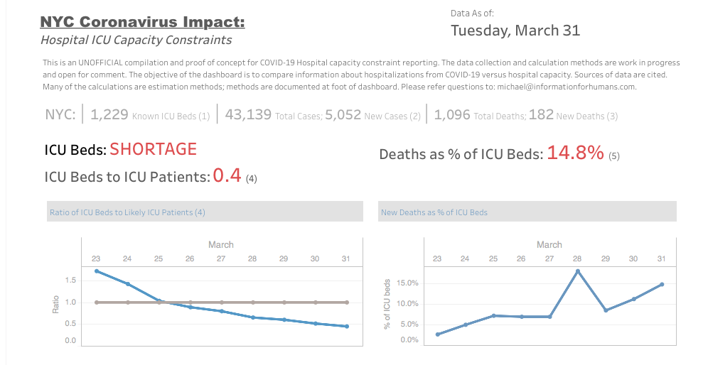
An important constraint on care giving is the number of beds in a hospital care setting that can provide ICU support. Depending on your source, as of the beginning of this year we had between 1,300 - 1,500 ICU beds in NYC. A complete description of the ICU requirements, and expansion of these requirements under emergency surges, can be found at https://www1.nyc.gov/assets/doh/downloads/pdf/em/icuce-tool.pdf.

Many of these beds were already occupied at the beginning of the year by people who needed ICU in the course of our normal lives: cancer, heart disease, car accidents, flu. But with our average deaths this week being 100-200 per day, and a caseload of over 40,000 people, the math plays out for professional care takers and amateur analysts alike: not enough ICU to support even that fraction of 40,000 people who need critical life-saving support. Right now.

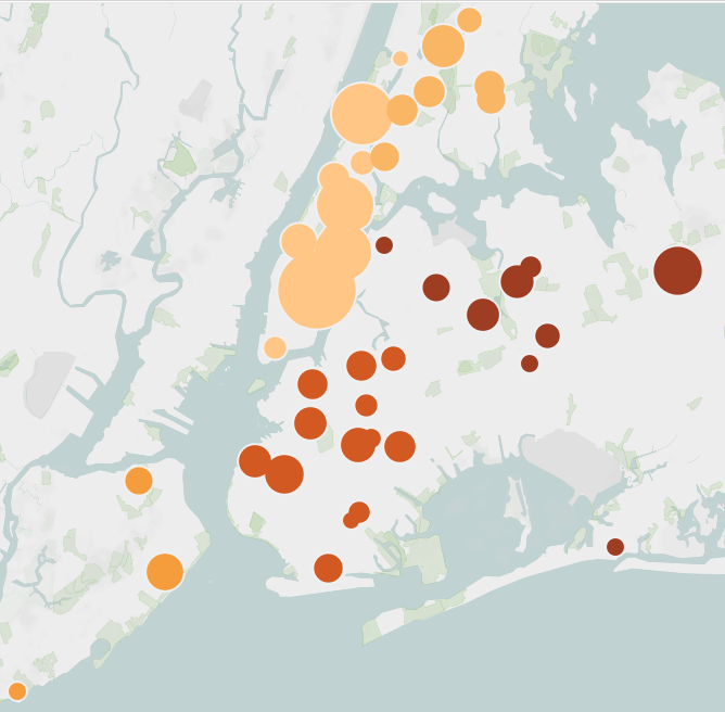
Ignorantly, but hopefully helpful, I pulled together some analysis, mostly for myself, that asked: where are our NYC hospitals? Are they evenly distributed through the boroughs and population so that the patient load would be evenly distributed? How many beds do they have, and of those, how many are ICU? The answer was: it’s bad. Hospitals are unevenly distributed through our geography and population, with some of the biggest concentration in Manhattan. Due to gentrification, demographics, and socio-economic factors, that’s a disproportionate allocation of ICU. People living in Queens and Brooklyn are in real need of immediate lifesaving care, and by the numbers, it’s harder to get.

My methods are probably off, the estimates are probably not good, but even with a lot of mistakes and ignorance, the picture is still pretty awful. We are asking health care workers to handle 2X -3X more dying people than what they are able to reasonably do. It’s heartbreaking for all of us here in NYC.

While this has been happening, I’ve been hugely privileged. I’ve been in my comfortable, safe Brooklyn apartment, well stocked with food. I haven’t been forced to go outside to get to work, and my work doesn’t put me in contact with others where I can either infect or be infected. I don’t have a mother or a grandmother living with me that I’d put at risk. My landlord isn’t trying to evict me. I’m benefitting from the law and order and safety that my local police force are delivering, while putting themselves at greater risk every day. I’m benefitting from the behind-the-scenes effort that my utility companies are putting in to keep our water running and our electricity flowing and our garbage collected. Yesterday I received a few admittedly non-critical food items from underpaid and underprotected Amazon workers. In New York City, my home, I’m alongside several million human beings who don’t have those things, and who, every day, still carry on in the face of it all, knowing the lack of those things could be their death sentence, or for someone they love.

I’ve put my name on many lists for volunteer opportunities. It’s probably a reflection of the heart and soul of so many New Yorkers that they haven’t gotten to my name on the list yet. And, it’s been a relief that at least one of my clients has now turned my work and theirs toward doing something productive about it. Instead of working here on abstractions for a life that’s been put on pause, I’ve been given a chance to work on things that will help people deal with this. That’s lifted me out of this disassociated despair I feel.

Meanwhile, the least I can and will continue to do will to be to update that analysis, and post it, daily. If nothing more, to remind myself of what’s going on outside, and the people who are risking their lives to keep us safe and well. And in the course of it, acknowledge somebody that may be tired, or may have fallen, in this fight. The daily candle is lit, here: https://public.tableau.com/profile/informationforhumans#!/vizhome/NYMetroIntensiveCareCapacity/Dashboard22?publish=yes

Web Annotation: Hoboes of the Internet? by Michael Thompson

Does web annotation like diigo or a.nnotate have a coherent future? Or will it always be a fragmented set of standards, apps, and users using private forums to exchange information?

Hobo culture of the late 19th and early 20th century United States found a common language for marking up the public domain - the hoboglyph.

Hobo Signs.png


These were not spray painted tags that permanently defaced walls and buildings. The symbols were penned in chalk or coal, reflecting both the impermanence of the sitrep as well as a measure of respect for the general public.

And this reflected a broader moral code and pragmatism of the hobo. Although the term 'hobo' is often used as a pejorative term, the social network of itinerant workers using rail to transport themselves to employment opportunities was in fact rich with moral code, standards, and norms. For example, the hobo code:

  1. Decide your own life, don't let another person run or rule you.

  2. When in town, always respect the local law and officials, and try to be a gentleman at all times.

  3. Don't take advantage of someone who is in a vulnerable situation, locals or other hobos.

  4. Always try to find work, even if temporary, and always seek out jobs nobody wants. By doing so you not only help a business along, but ensure employment should you return to that town again.

  5. When no employment is available, make your own work by using your added talents at crafts.

  6. Do not allow yourself to become a stupid drunk and set a bad example for locals' treatment of other hobos.

  7. When jungling in town, respect handouts, do not wear them out, another hobo will be coming along who will need them as badly, if not worse than you.

  8. Always respect nature, do not leave garbage where you are jungling.

  9. If in a community jungle, always pitch in and help.

  10. Try to stay clean, and boil up wherever possible.

  11. When traveling, ride your train respectfully, take no personal chances, cause no problems with the operating crew or host railroad, act like an extra crew member.

  12. Do not cause problems in a train yard, another hobo will be coming along who will need passage through that yard.

  13. Do not allow other hobos to molest children, expose all molesters to authorities, they are the worst garbage to infest any society.

  14. Help all runaway children, and try to induce them to return home.

  15. Help your fellow hobos whenever and wherever needed, you may need their help someday.

  16. If present at a hobo court and you have testimony, give it. Whether for or against the accused, your voice counts!

Fast forward to web annotation. Is it the modern hoboglyph? There's plenty of examples of attempted - and failed - apps that would bring an annotated web experience to users, ranging from the academic to those looking to create a public or even subversive forum, like ThirdVoice or ShiftSpace:

Screen Shot 2019-02-19 at 10.31.24 PM.png


The Web Annotation Working Group manages technical and architectural standards for annotation.

However, is there a moral code and unifying purpose that can guide the 'what' of online annotation, versus the 'how'?  And could that ever be used by a purposeful but transient set of browsers who don't  remain in a single, limited web sphere, but instead travel across the web with a unified purpose and objective?